Data Visualisation
Python Libraries and Config
%matplotlib inline
import numpy as np
import pandas as pd
import matplotlib.pyplot as plt
import seaborn as sns; sns.set()
sns.set(style="ticks", color_codes=True)
sns.set_context("notebook")
sns.set({ "figure.figsize": (12/1.5,8/1.5) })
sns.set_style("white", {'axes.edgecolor':'gray'})
R Libraries
library(tidyverse)
library(operators)
library(magrittr)
library(dplyr)
library(knitr)
library(sf)
library(usmap)
library(waffle)
library(treemapify)
library(viridis)
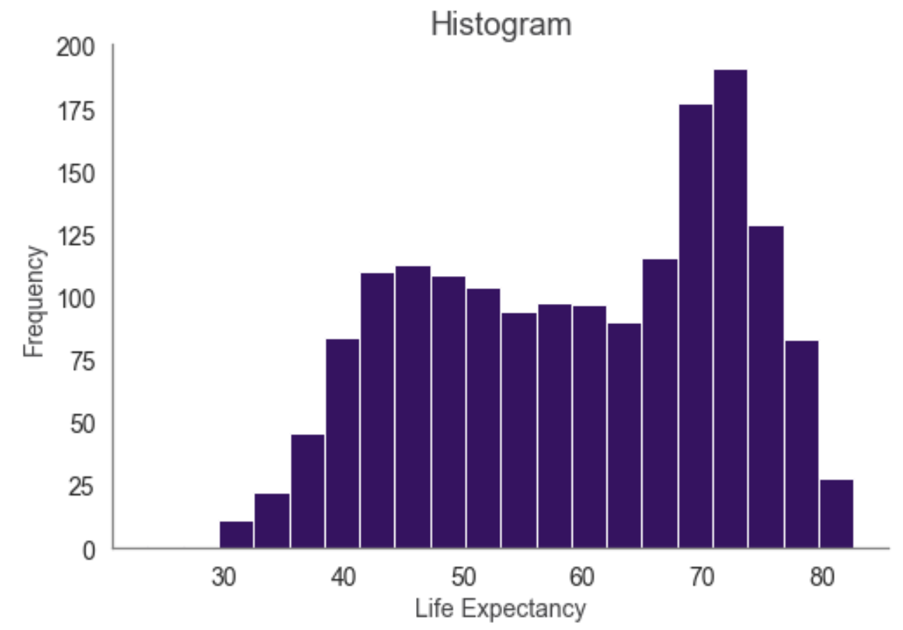
One Numerical Variable
Python code:
df['lifeExp'].plot.hist(bins=20, color='#3A0B64');
plt.title('Histogram', fontsize=18, color='#3F3F41');
plt.ylabel('Frequency', fontsize=14, color='#3F3F41');
plt.xlabel('Life Expectancy', fontsize=14, color='#3F3F41');
plt.tick_params(labelsize=14, color='#3F3F41');
sns.despine();
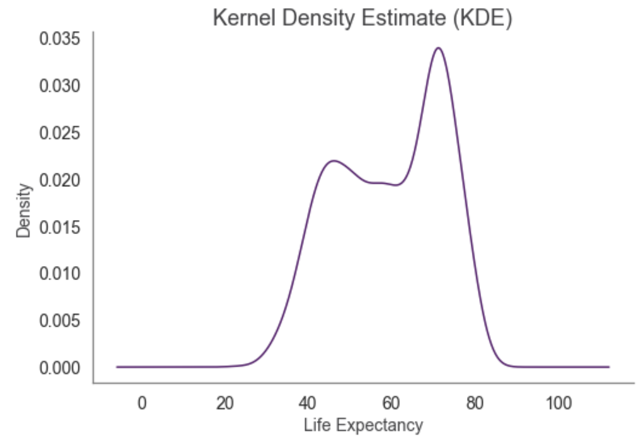
Python code:
df['lifeExp'].plot.kde(color='#58186C');
plt.title('Kernel Density Estimate (KDE)', fontsize=18, color='#3F3F41');
plt.ylabel('Density', fontsize=14, color='#3F3F41');
plt.xlabel('Life Expectancy', fontsize=14, color='#3F3F41');
plt.tick_params(labelsize=14, color='#3F3F41');
sns.despine();
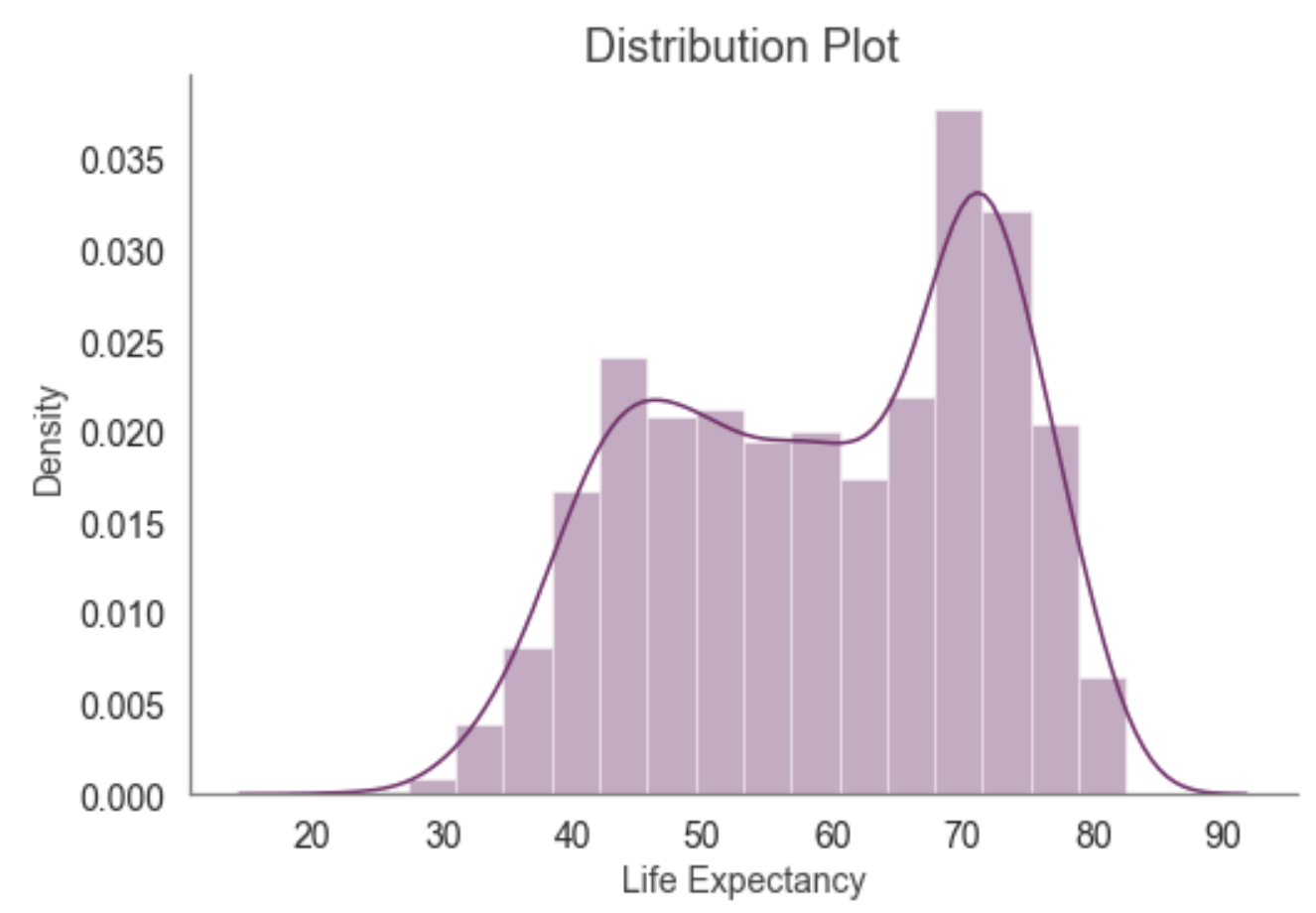
Python code:
sns.distplot(df['lifeExp'], color='#77286A');
plt.title('Distribution Plot', fontsize=18, color='#3F3F41');
plt.ylabel('Density', fontsize=14, color='#3F3F41');
plt.xlabel('Life Expectancy', fontsize=14, color='#3F3F41');
plt.tick_params(labelsize=14, color='#3F3F41');
sns.despine();
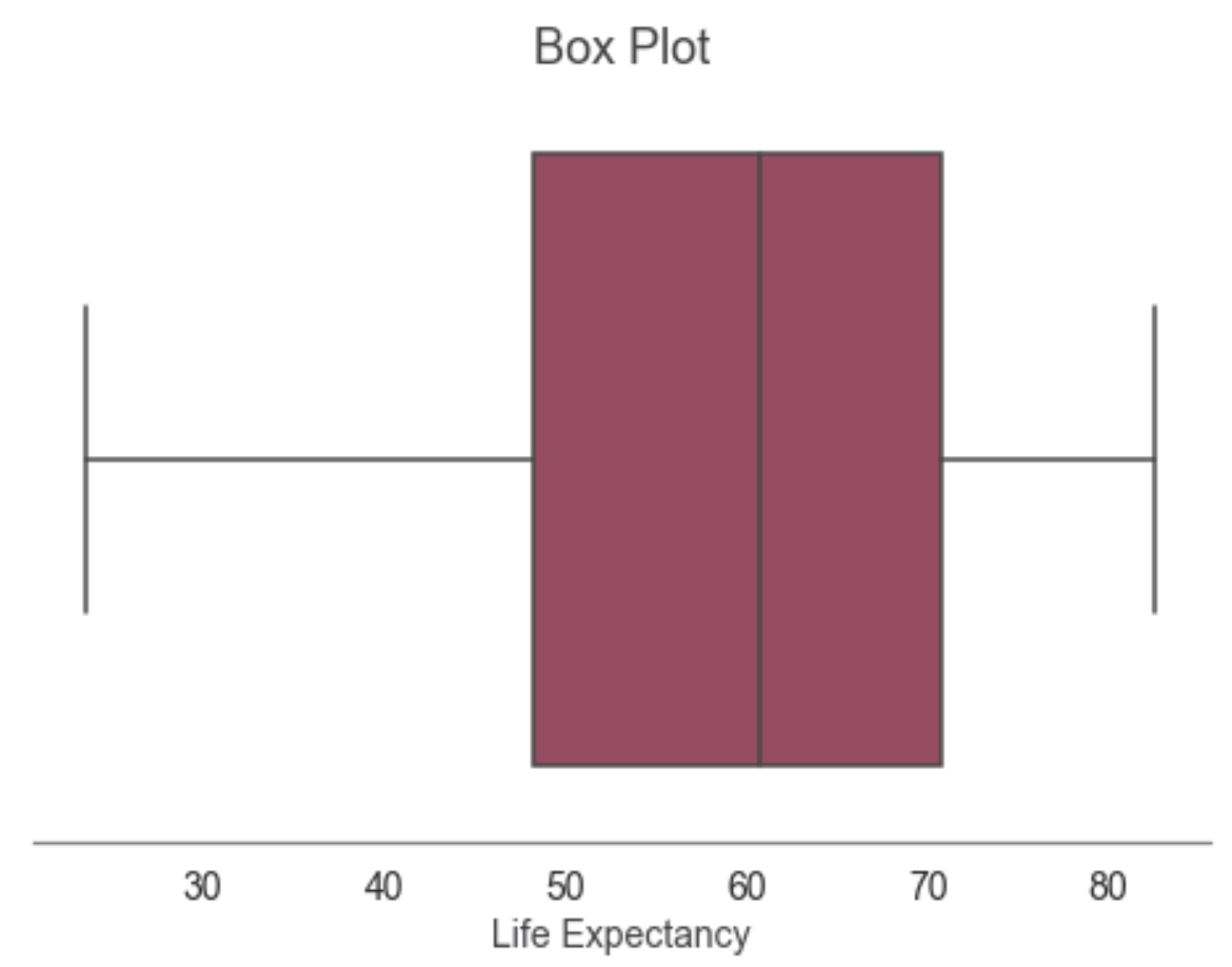
Python code:
sns.boxplot(df['lifeExp'], color='#B0385E');
plt.title('Box Plot', fontsize=18, color='#3F3F41');
plt.xlabel('Life Expectancy', fontsize=14, color='#3F3F41');
plt.tick_params(labelsize=14, color='#3F3F41');
sns.despine(left=True);
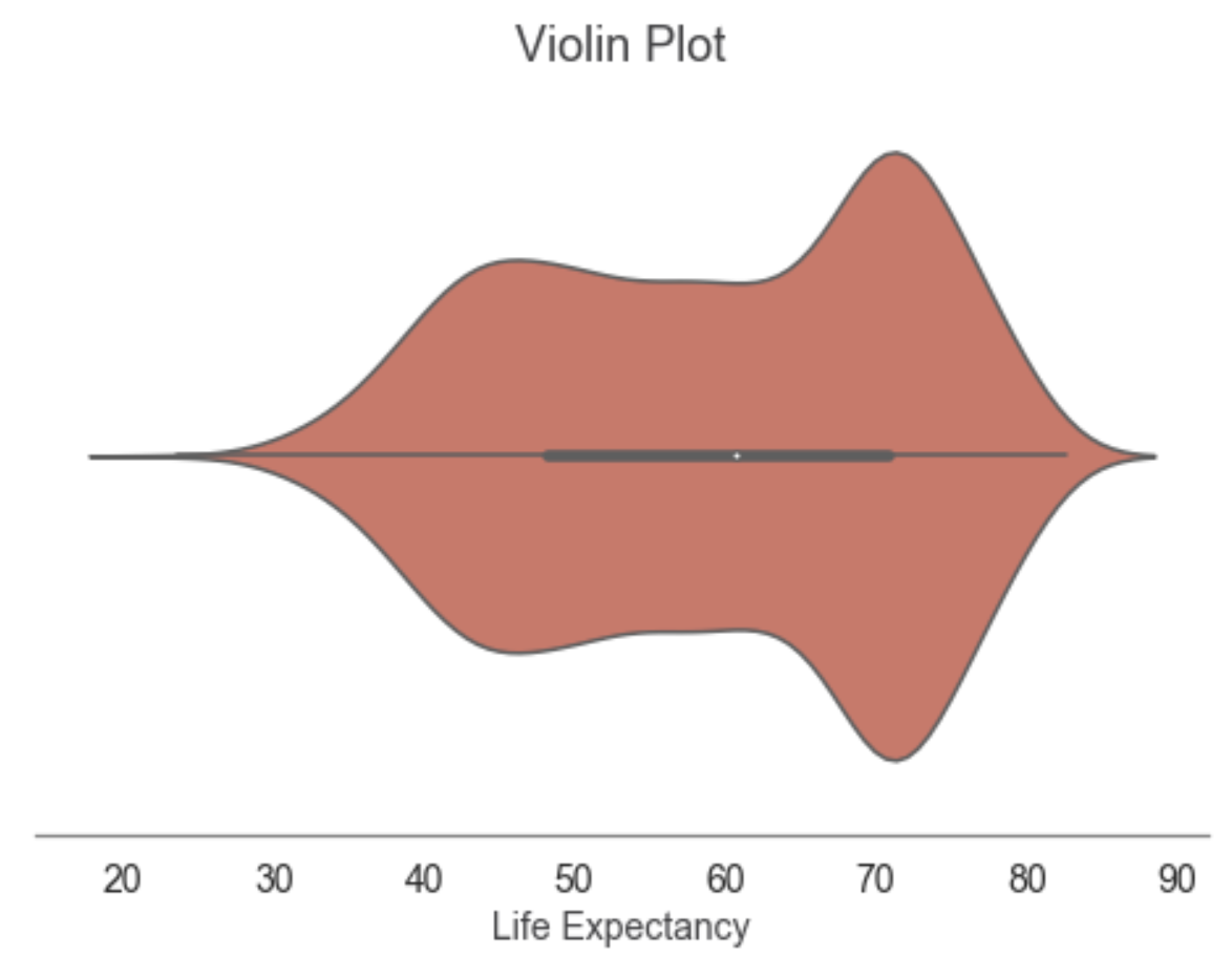
Python code:
sns.violinplot(df['lifeExp'], color='#E46855');
plt.title('Violin Plot', fontsize=18, color='#3F3F41');
plt.xlabel('Life Expectancy', fontsize=14, color='#3F3F41');
plt.tick_params(labelsize=14, color='#3F3F41');
sns.despine(left=True);
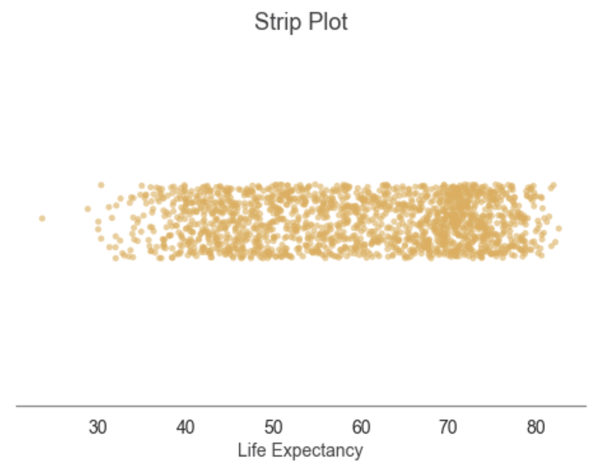
Python code:
sns.stripplot(x='lifeExp', data=df, color='#E2AD51', alpha=0.6, jitter=True);
plt.title('Strip Plot', fontsize=18, color='#3F3F41');
plt.xlabel('Life Expectancy', fontsize=14, color='#3F3F41');
plt.tick_params(labelsize=14, color='#3F3F41');
sns.despine(left=True);
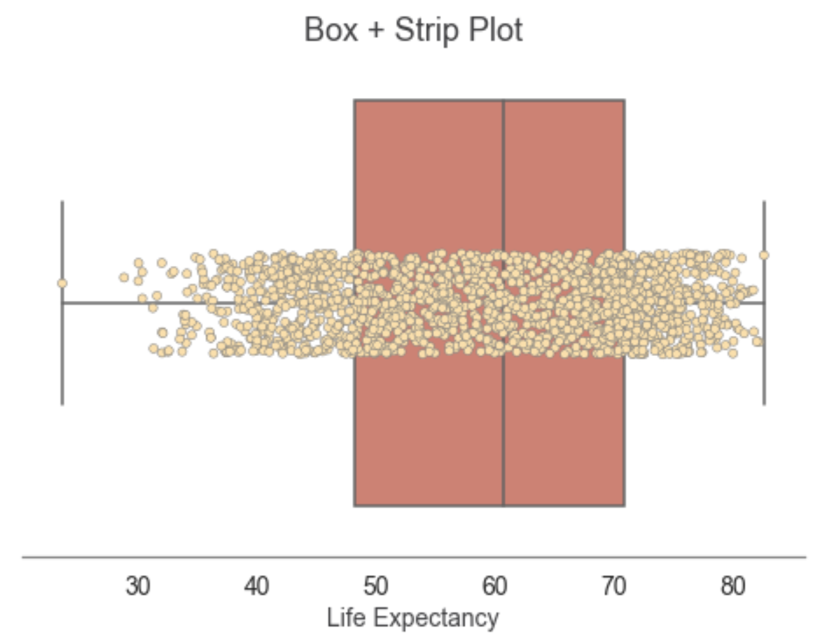
Python code:
cur_ax = sns.boxplot(x='lifeExp', data=df, color='#E8725F')
sns.stripplot(x='lifeExp', data=df, jitter=True, linewidth=0.5, ax=cur_ax, color='#FEDFA5');
plt.title('Box + Strip Plot', fontsize=18, color='#3F3F41');
plt.xlabel('Life Expectancy', fontsize=14, color='#3F3F41');
plt.tick_params(labelsize=14, color='#3F3F41');
sns.despine(left=True);
One Categorical Variable
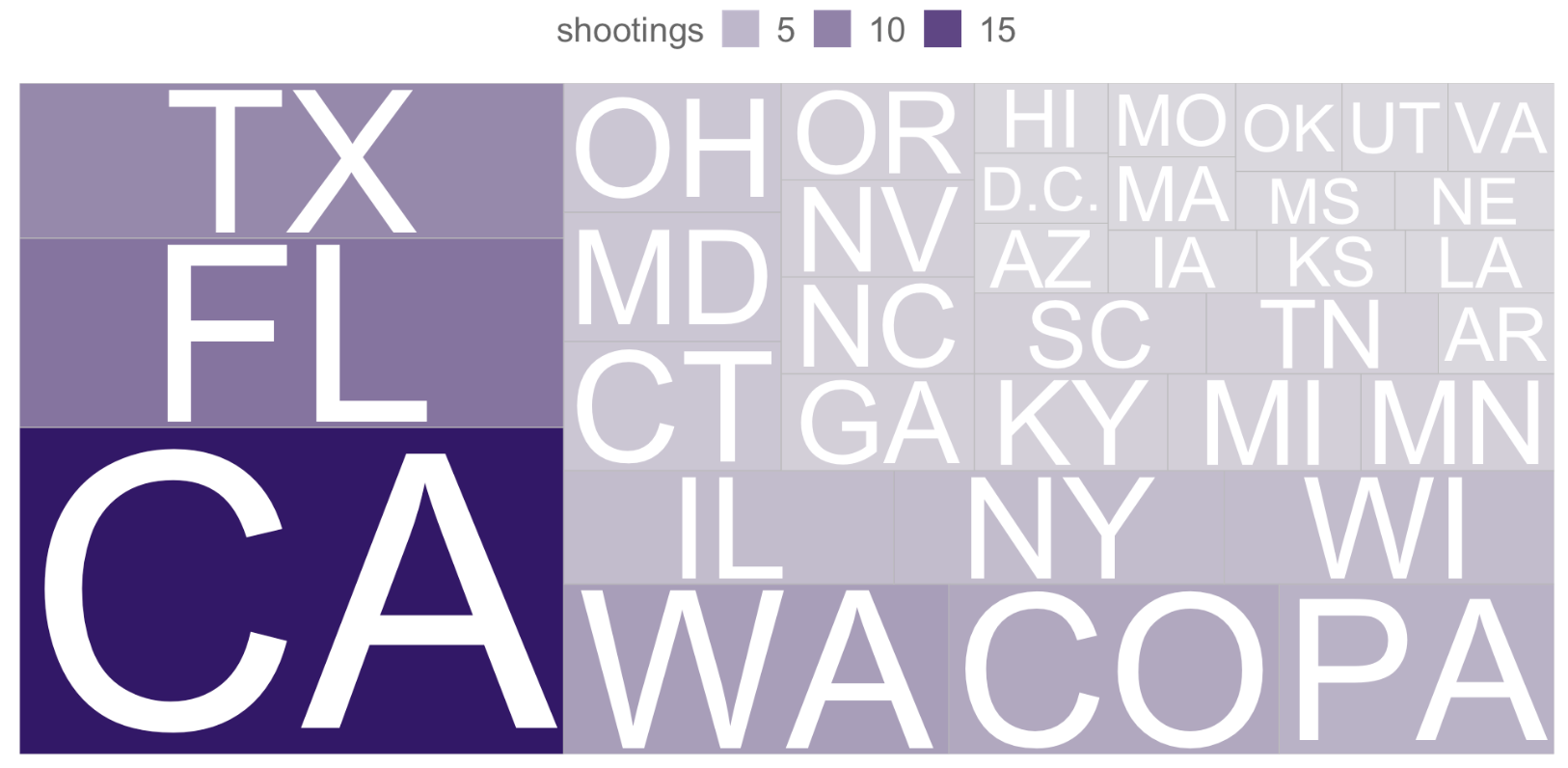
R code:
# Create a new data frame that shows number of shootings by state
shootings_per_state <- data.frame(table(cleansed_data$state))
# Change the column heading names to "state" and "shootings"
colnames(shootings_per_state) <- c("state", "shootings")
# Create a treemap chart of the shootings per state
treemap_state_shootings <- ggplot(shootings_per_state, aes(area = shootings, label = state)) +
theme(
legend.position = "top",
legend.title = element_text(colour = "#666666", size = 16),
legend.text = element_text(colour = "#666666", size = 16))+
geom_treemap(aes(alpha = shootings), fill = colour_palette[20]) +
geom_treemap_text(colour = "white", place = "centre",
grow = TRUE)
# Display the treemap chart of shootings per state
treemap_state_shootings
Python code:
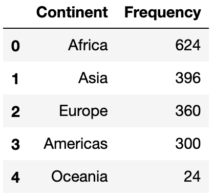
continent_le = pd.DataFrame(df['continent'].value_counts())
continent_le.reset_index(inplace=True)
continent_le.columns = ['Continent', 'Frequency']
continent_le
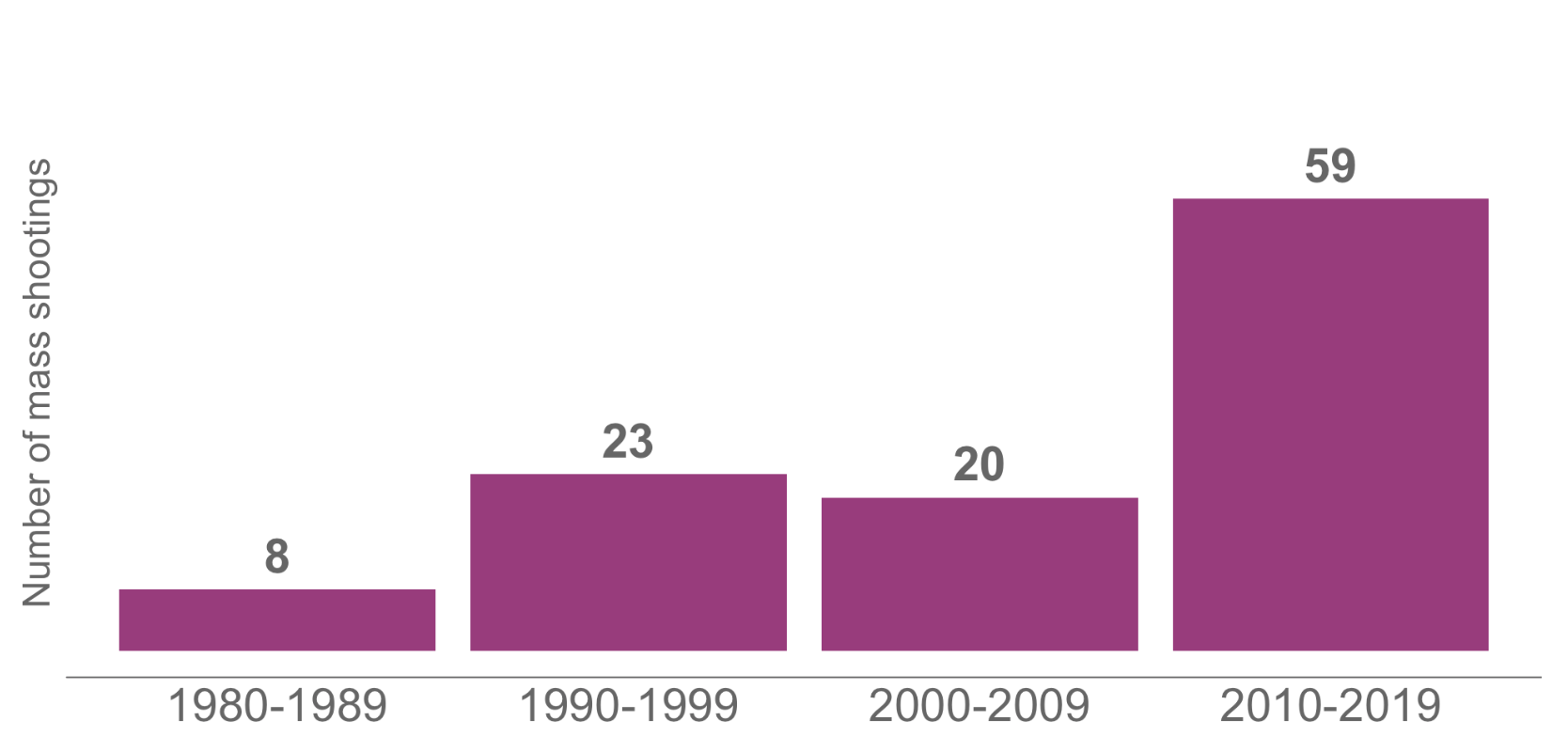
R code:
# Create a new column called decade and populate it with the decade of each shooting
cleansed_data$decade <- case_when(
cleansed_data$year < "1990" ~ "1980-1989",
cleansed_data$year > "1989" & cleansed_data$year < "2000" ~"1990-1999",
cleansed_data$year > "1999" & cleansed_data$year < "2010" ~"2000-2009",
cleansed_data$year > "2009" & cleansed_data$year < "2020" ~"2010-2019"
)
# Create a new data frame that shows number of shootings per decade
shootings_per_decade <- data.frame(table(cleansed_data$decade))
# Change the column heading names to "decade" and "shootings"
colnames(shootings_per_decade) <- c("decade", "shootings")
# Create a bar chart using ggplot2 to show shootings by decade
plot_decade <- ggplot(shootings_per_decade, aes(y=shootings, x=decade)) +
geom_bar(position="dodge", stat="identity", fill = colour_palette[47]) +
labs(x = "Decade",
y = "Number of mass shootings") +
geom_text(aes(label=shootings), vjust = -0.5, size = 8, col = "#666666", fontface = "bold") +
theme(
axis.text.y = element_blank(),
axis.text.x = element_text(colour = "#666666", size = 22),
axis.ticks = element_blank(),
axis.title.y = element_text(colour = "#666666", size = 18),
axis.title.x = element_blank(),
panel.background = element_blank(),
axis.line.x = element_line(colour = "#666666"),
plot.margin=unit(c(1,0,1,0),"cm")) +
coord_cartesian(ylim=c(0,70))
# Display the chart
plot_decade
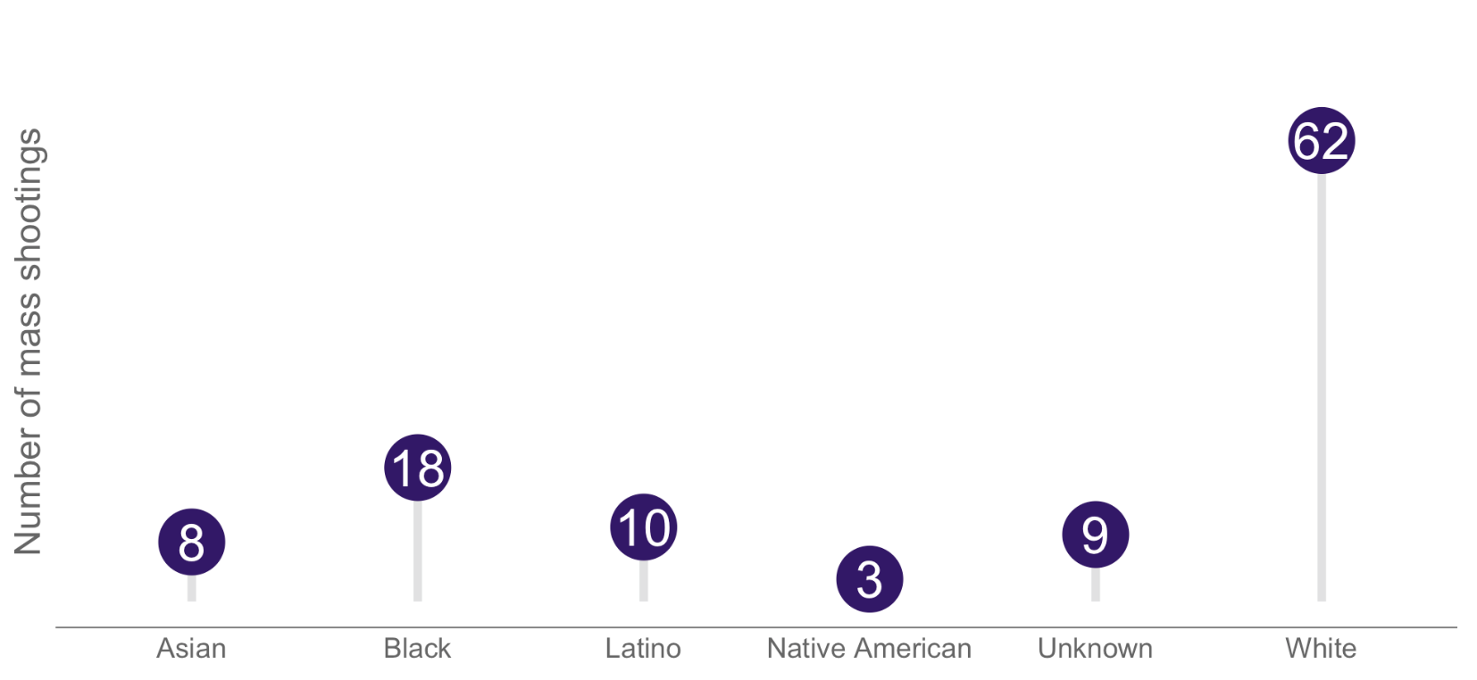
R code:
# Create a new data frame that shows number of shootings per race
shootings_per_race <- data.frame(table(cleansed_data$race))
# Change the column heading names to "race" and "shootings"
colnames(shootings_per_race) <- c("race", "shootings")
# Create a lollipop chart using ggplot2 to show number of shootings per race
lollipop_race <- ggplot(shootings_per_race, aes(y=shootings, x=reorder(race, -shootings))) +
geom_segment( aes(x = race, xend=race, y=0, yend=shootings),
color = "#e0e1e2",
size = 2) +
geom_point( size=15,
color=colour_palette[20],
fill=colour_palette[20],
shape=21
) +
labs(y = "Number of mass shootings") +
geom_text(aes(label=shootings),hjust=0.5, vjust=0.5, color = "#FFFFFF", size = 9) +
theme(
axis.text.y = element_blank(),
axis.text.x = element_text(colour = "#666666", size = 14),
axis.ticks = element_blank(),
axis.title.y = element_text(colour = "#666666", size = 18),
axis.title.x = element_blank(),
panel.background = element_blank(),
axis.line.x = element_line(colour = "#666666"),
plot.margin=unit(c(1,0,1,0),"cm"))+
coord_cartesian(ylim=c(0,70))
# Display the chart
lollipop_race
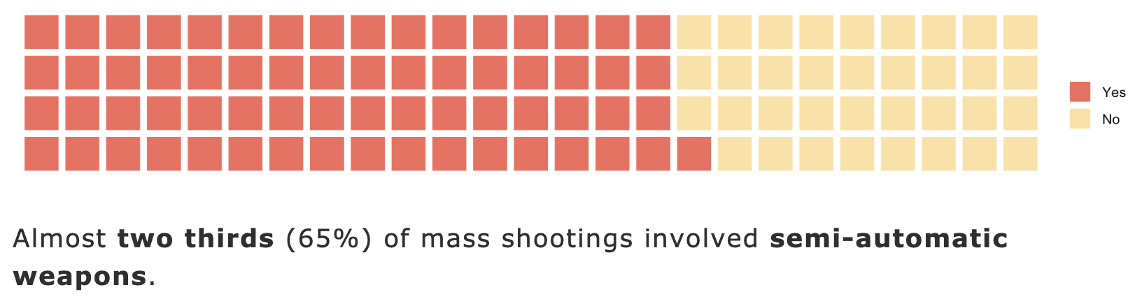
R code:
# Create a new column called semi_auto_used and
# populate it with Yes or No depending on whether the shooter used a semi-automatic weapon
cleansed_data$semi_auto_used <- "No"
cleansed_data[grep("automatic", cleansed_data$weapon_type, ignore.case = TRUE), "semi_auto_used"] <- "Yes"
# Create a new data frame that shows number of shootings by whether semi automatic weapons were used
shootings_per_semi <- data.frame(table(cleansed_data$semi_auto_used))
# Change the column heading names to "semi automatic weapon used" and "shootings"
colnames(shootings_per_semi) <- c("semi_auto_used", "shootings")
# Add a Percentage column containing the % of shootings for each category (yes, no)
shootings_per_semi$percentage <- round(shootings_per_semi$shootings / sum(shootings_per_semi$shootings) * 100, 0)
# Create a waffle chart
semi_auto_waffle <- waffle(c('Yes'=65, 'No'=35), rows = 4, colors = c('Yes'= colour_palette[70], 'No'=colour_palette[95]))
# Display the waffle chart
semi_auto_waffle
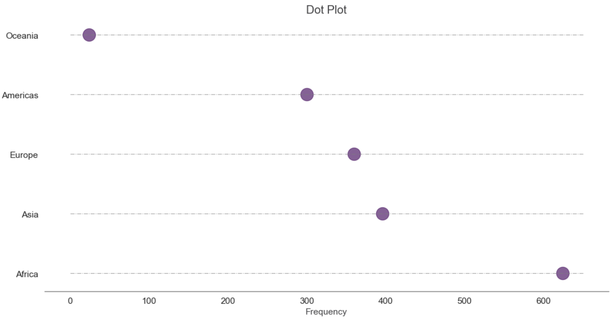
Python code:
# Prepare Data
dot_df = df.groupby('continent').size().reset_index(name='counts').\
sort_values('counts', ascending=False)
# Draw plot
fig, ax = plt.subplots(figsize=(16,8), dpi= 80)
ax.hlines(y=dot_df.continent, xmin=0, xmax=650, color='gray', alpha=0.7, linewidth=1, linestyles='dashdot')
ax.scatter(y=dot_df.continent, x=dot_df.counts, s=400, color='#58186C', alpha=0.7)
# Title, Label, Ticks and Ylim
plt.title('Dot Plot', fontsize=18, color='#3F3F41');
plt.xlabel('Frequency', fontsize=14, color='#3F3F41');
plt.tick_params(labelsize=14, color='#3F3F41');
sns.despine(left=True);
plt.show()
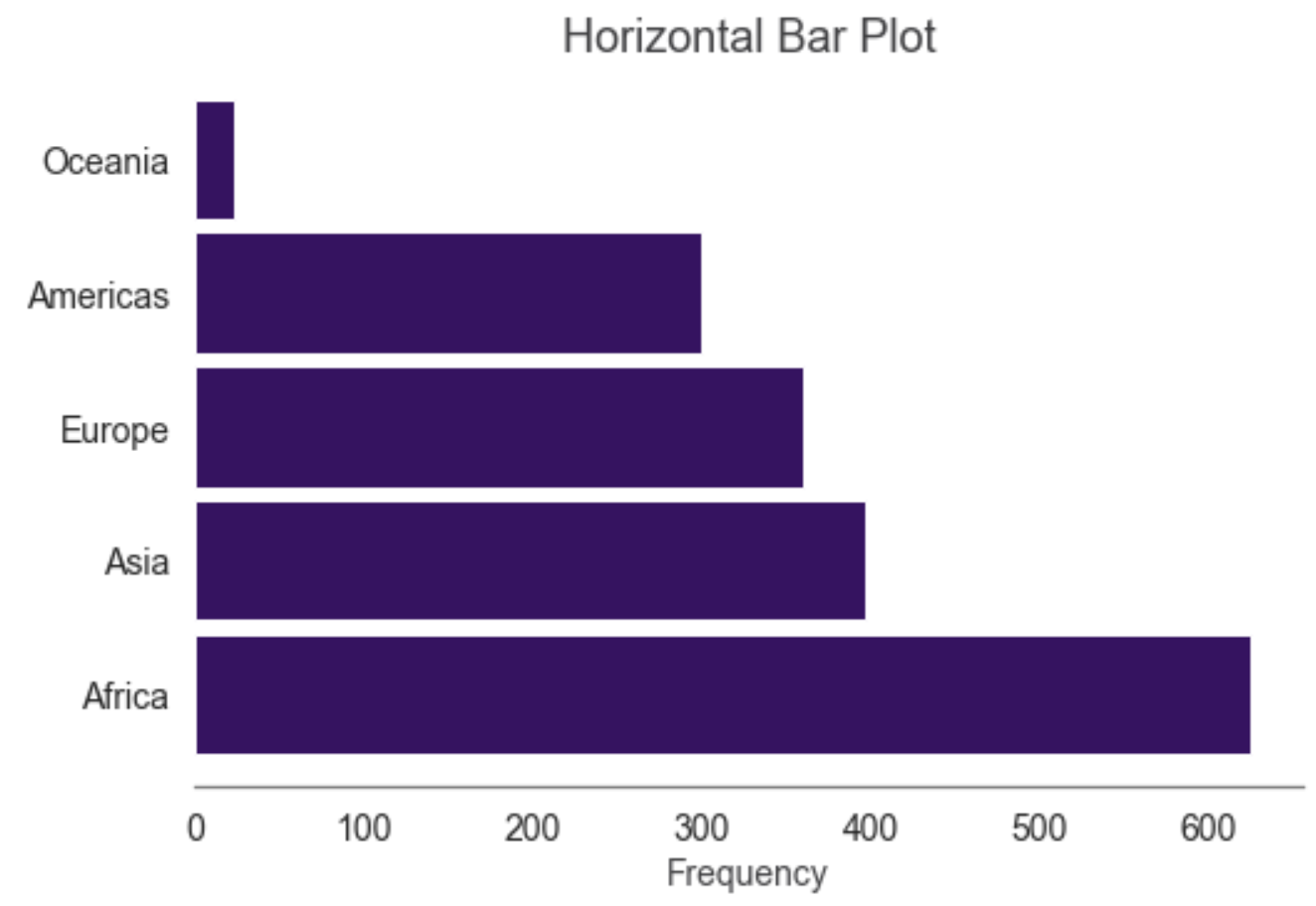
Python code:
continent_le.plot.barh(x='Continent', y='Frequency', color='#3A0B64', width=0.9);
plt.title('Horizontal Bar Plot', fontsize=18, color='#3F3F41');
plt.ylabel(None);
plt.xlabel('Frequency', fontsize=14, color='#3F3F41');
plt.tick_params(labelsize=14, color='#3F3F41');
plt.legend().set_visible(False);
sns.despine(left=True);
One Category and One Number
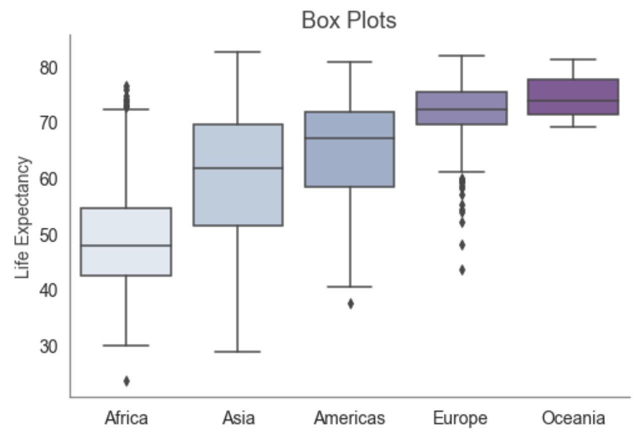
Python code:
with sns.color_palette("BuPu"):
sns.boxplot(x='continent', y='lifeExp', data=df , order=["Africa", "Asia", "Americas", "Europe", "Oceania"]);
plt.title('Box Plots', fontsize=18, color='#3F3F41');
plt.xlabel('Continent', fontsize=14, color='#3F3F41');
plt.ylabel('Life Expectancy', fontsize=14, color='#3F3F41');
plt.tick_params(labelsize=14, color='#3F3F41');
sns.despine();
Python code:
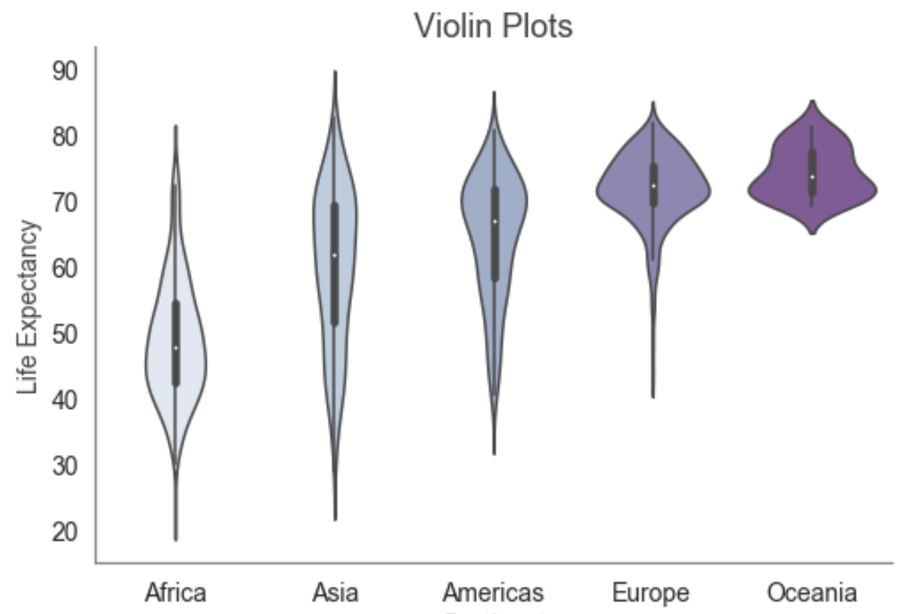
with sns.color_palette("BuPu"):
sns.violinplot(x='continent', y='lifeExp', data=df, order=["Africa", "Asia", "Americas", "Europe", "Oceania"]);
plt.title('Violin Plots', fontsize=18, color='#3F3F41');
plt.xlabel('Continent', fontsize=14, color='#3F3F41');
plt.ylabel('Life Expectancy', fontsize=14, color='#3F3F41');
plt.tick_params(labelsize=14, color='#3F3F41');
sns.despine();
Python code:
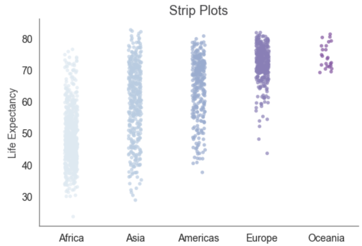
with sns.color_palette("BuPu"):
sns.stripplot(x='continent', y='lifeExp', data=df, alpha=0.7,
order=["Africa", "Asia", "Americas", "Europe", "Oceania"],
jitter=True);
plt.title('Strip Plots', fontsize=18, color='#3F3F41');
plt.xlabel('Continent', fontsize=14, color='#3F3F41');
plt.ylabel('Life Expectancy', fontsize=14, color='#3F3F41');
plt.tick_params(labelsize=14, color='#3F3F41');
sns.despine();
Python code:
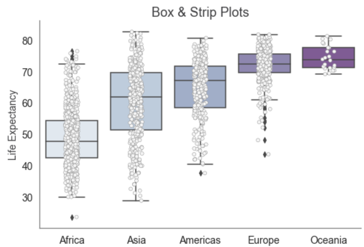
with sns.color_palette("BuPu"):
cur_ax = sns.boxplot(x='continent', y='lifeExp', data=df,
order=["Africa", "Asia", "Americas", "Europe", "Oceania"])
sns.stripplot(x='continent', y='lifeExp', data=df,
order=["Africa", "Asia", "Americas", "Europe", "Oceania"],
jitter=True, linewidth=0.5, color='#f5f5f5', ax=cur_ax);
plt.title('Box & Strip Plots', fontsize=18, color='#3F3F41');
plt.xlabel('Continent', fontsize=14, color='#3F3F41');
plt.ylabel('Life Expectancy', fontsize=14, color='#3F3F41');
plt.tick_params(labelsize=14, color='#3F3F41');
sns.despine();
Python code:
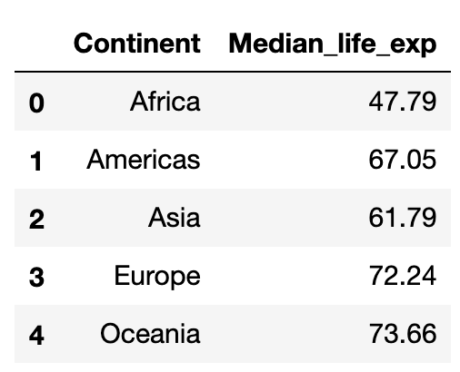
cont_le_ft = pd.DataFrame(df.groupby(by=['continent'])['lifeExp'].median().round(2))
cont_le_ft.reset_index(inplace=True)
cont_le_ft.columns = ['Continent', 'Median_life_exp']
cont_le_ft
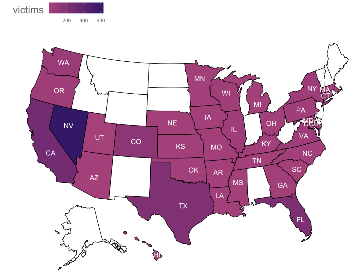
R code:
# Create a new data frame that shows number of victims by state
victims_by_state <- aggregate(cleansed_data$total_victims, by=list(cleansed_data$state), FUN = sum)
# Change the column heading names to "state" and "victims"
colnames(victims_by_state) <- c("state", "victims")
# Create a chart showing the states on a map of the US and shade the states by the number of victims
plot_state_map_victims <- plot_usmap(data = victims_by_state, values = "victims",
regions = "states", labels = TRUE, label_color = "white") +
scale_fill_continuous(low = colour_palette[50], high = colour_palette[20],
na.value = "white", name = "victims") +
theme(
legend.position = "top",
legend.title = element_text(colour = "#666666", size = 16, vjust = 0.75),
legend.text = element_text(colour = "#666666", size = 8),
plot.margin=unit(c(1,0,1,0),"cm"))
# Display the map chart
plot_state_map_victims
Python code:
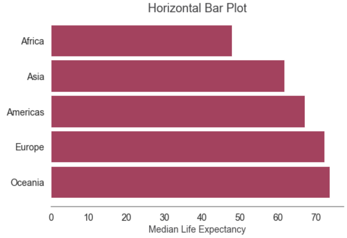
cont_le_ft = pd.DataFrame(df.groupby(by=['continent'])['lifeExp'].median().round(2))
cont_le_ft.reset_index(inplace=True)
cont_le_ft.columns = ['Continent', 'Median_life_exp']
cont_le_ft.sort_values('Median_life_exp', ascending=False)\
.plot.barh(x='Continent', y='Median_life_exp', color='#B0385E', width=0.9);
plt.title('Horizontal Bar Plot', fontsize=18, color='#3F3F41');
plt.xlabel('Median Life Expectancy', fontsize=14, color='#3F3F41');
plt.ylabel(None);
plt.legend().set_visible(False);
plt.tick_params(labelsize=14, color='#3F3F41');
sns.despine(left=True);
Python code:
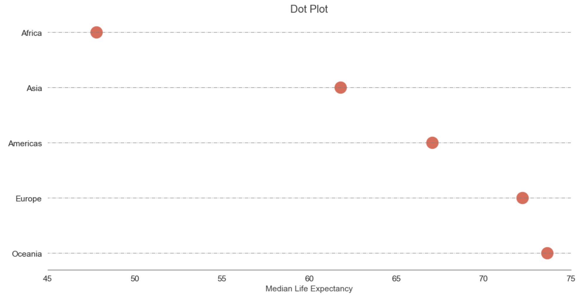
cont_le_ft = cont_le_ft.sort_values('Median_life_exp', ascending=False)
fig, ax = plt.subplots(figsize=(16,8), dpi= 80)
ax.hlines(y=cont_le_ft.Continent, xmin=0, xmax=100, color='gray', alpha=0.8, linewidth=1, linestyles='dashdot')
ax.scatter(y=cont_le_ft.Continent, x=cont_le_ft.Median_life_exp, s=400, color='#E46855')
plt.title('Dot Plot', fontsize=18, color='#3F3F41');
plt.ylabel(None);
plt.xlabel('Median Life Expectancy', fontsize=14, color='#3F3F41');
plt.tick_params(labelsize=14, color='#3F3F41');
plt.xlim(45, 75);
sns.despine(left=True);
plt.show()
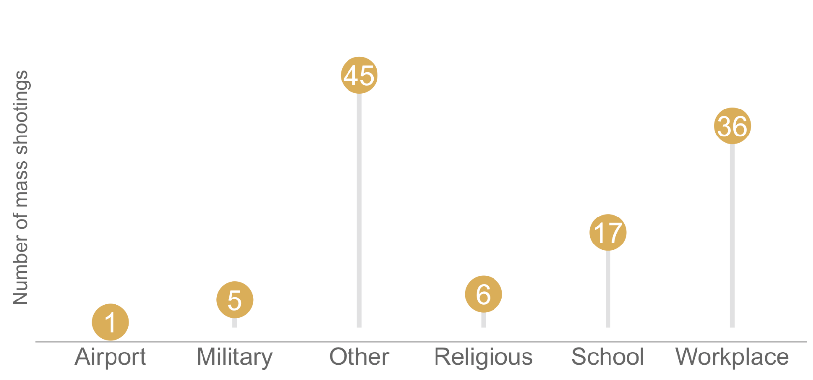
R code:
# Create a new data frame that shows number of shootings by location type
shootings_per_loc_type <- data.frame(table(cleansed_data$location.1))
# Change the column heading names to "location.1" and "shootings"
colnames(shootings_per_loc_type) <- c("location.1", "shootings")
# Create a lollipop chart using ggplot2 to show number of shootings per location type
lollipop_loc_type <- ggplot(shootings_per_loc_type, aes(y = shootings, x=location.1)) +
geom_segment( aes(x = location.1, xend=location.1, y=0, yend=shootings),
color = "#e0e1e2",
size = 2) +
geom_point( size=15,
color="#e1ad46",
fill="#e1ad46",
shape=21
) +
labs(y = "Number of mass shootings") +
geom_text(aes(label=shootings),hjust=0.5, vjust=0.5, color = "#FFFFFF", size = 9) +
theme(
axis.text.y = element_blank(),
axis.text.x = element_text(colour = "#666666", size = 22),
axis.ticks = element_blank(),
axis.title.y = element_text(colour = "#666666", size = 18),
axis.title.x = element_blank(),
panel.background = element_blank(),
axis.line.x = element_line(colour = "#666666"),
plot.margin=unit(c(1,0,1,0),"cm"))+
coord_cartesian(ylim=c(0,50))
# Display the chart
lollipop_loc_type
Two Numerical Variables
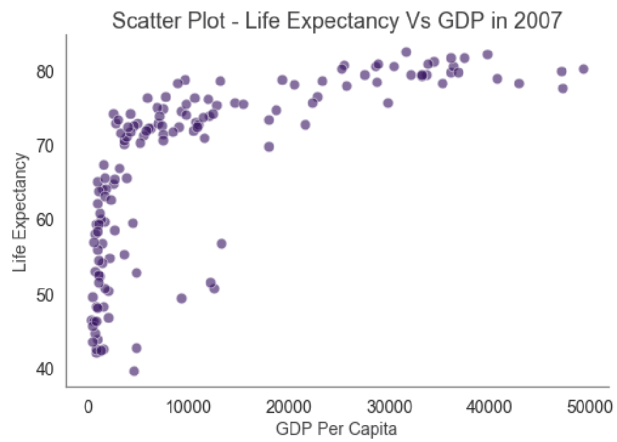
Python code:
df_2007 = df.loc[df['year']==2007]
sns.scatterplot(data=df_2007, x='gdpPercap', y='lifeExp', color='#3A0B64', alpha=0.6, s=75);
plt.title('Scatter Plot - Life Expectancy Vs GDP in 2007', fontsize=18, color='#3F3F41');
plt.xlabel('GDP Per Capita', fontsize=14, color='#3F3F41');
plt.ylabel('Life Expectancy', fontsize=14, color='#3F3F41');
plt.tick_params(labelsize=14, color='#3F3F41');
sns.despine();
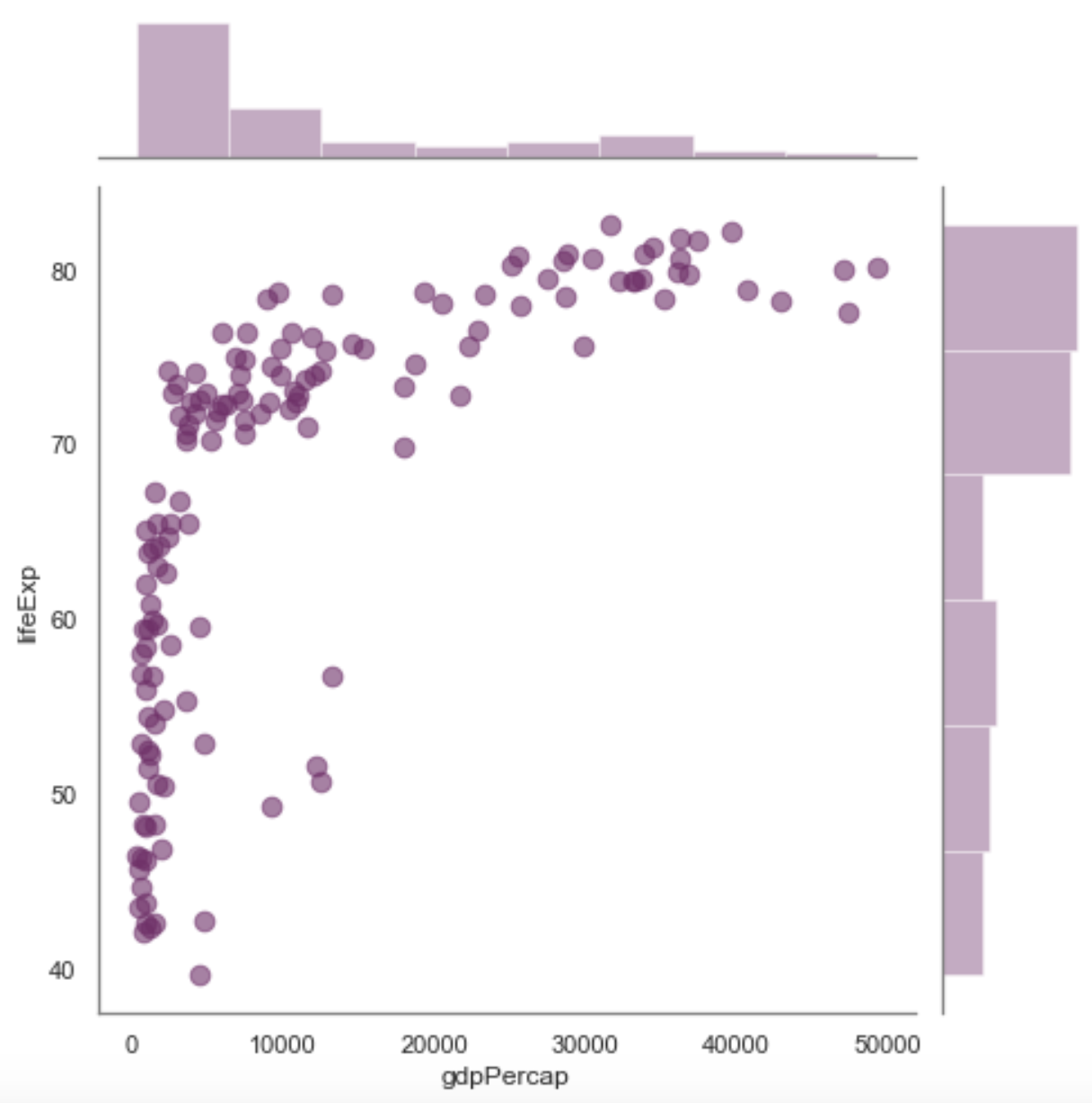
Python code:
sns.jointplot(data=df_2007, x='gdpPercap', y='lifeExp', height=7, color='#77286A', alpha=0.6, s=75);
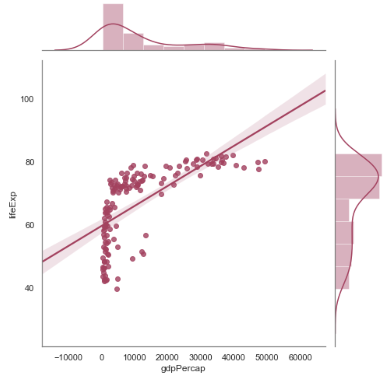
Python code:
sns.jointplot(data=df_2007, x='gdpPercap', y='lifeExp', color='#B0385E', height=7, kind="reg");
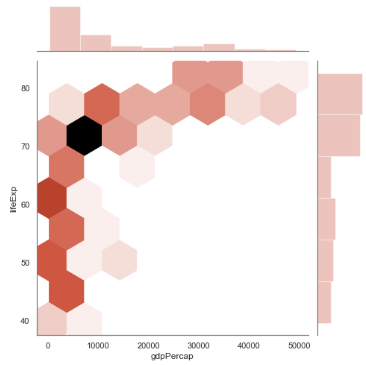
Python code:
sns.jointplot(data=df_2007, x='gdpPercap', y='lifeExp', color='#E46855', height=7, kind="hex");
Python code:
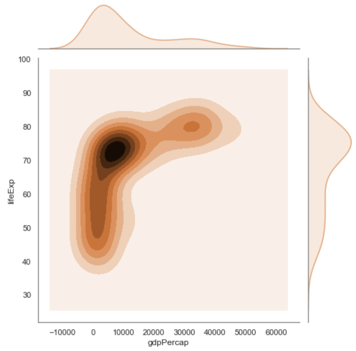
sns.jointplot(data=df_2007, x='gdpPercap', y='lifeExp', color='#EBA575', height=7, kind="kde");
Two Categories and One Number
Python code:
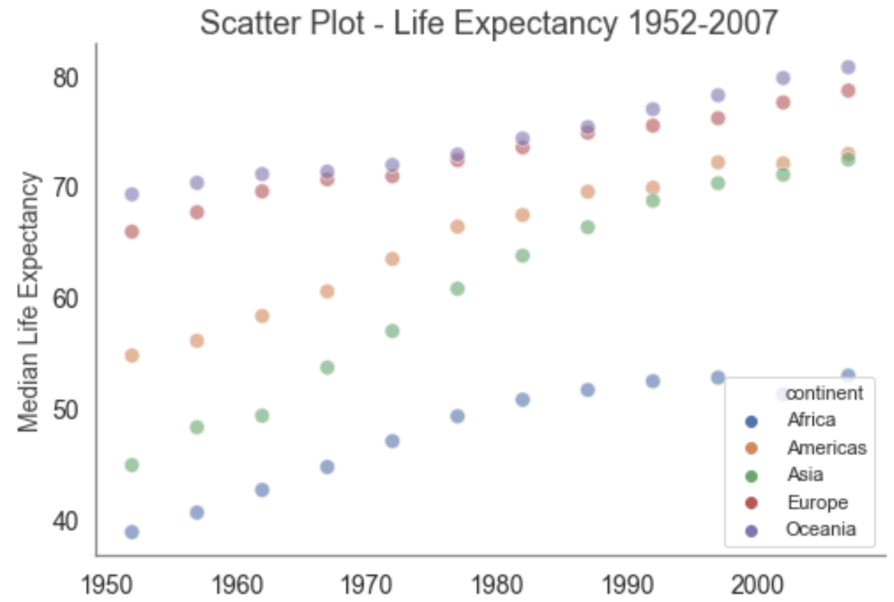
sns.scatterplot(data=two_cats_ft, x='year', y='median_life_exp', hue='continent', alpha=0.6, s=75);
plt.title('Scatter Plot - Life Expectancy 1952-2007', fontsize=18, color='#3F3F41');
plt.xlabel('Year', fontsize=14, color='#3F3F41');
plt.ylabel('Median Life Expectancy', fontsize=14, color='#3F3F41');
plt.tick_params(labelsize=14, color='#3F3F41');
sns.despine()
R code:
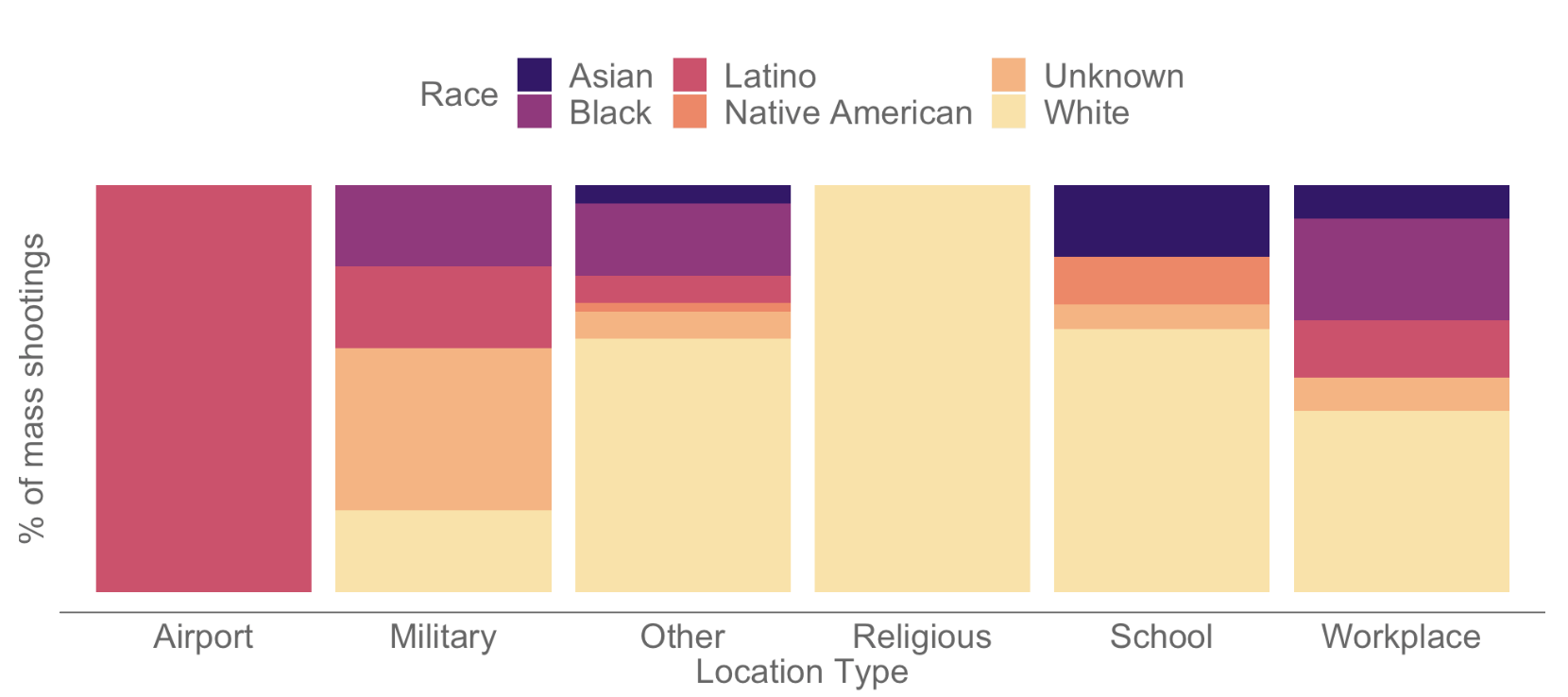
# Create a new data frame that shows number by location type and race
shootings_per_loc_type_race <- aggregate(cleansed_data$for_count,
by=list(cleansed_data$location.1, cleansed_data$race),FUN = sum)
# Change the column heading names to Location_Type, Race and Num_Shootings
colnames(shootings_per_loc_type_race) <- c("Location_Type", "Race", "Num_Shootings")
# Create a bar chart using ggplot2 to show shootings by location type and race
plot_loc_type_race <- ggplot() +
geom_bar(aes(y=Num_Shootings, x=Location_Type, fill=Race), data = shootings_per_loc_type_race,
stat = "identity", position = "fill") +
scale_fill_manual(values = c(colour_palette[20], colour_palette[45], colour_palette[60],
colour_palette[75], colour_palette[85], colour_palette[95])) +
labs(x = "Location Type",
y = "% of mass shootings",
fill = "Race") +
theme(
legend.position = "top",
legend.title = element_text(colour = "#666666", size = 16),
legend.text = element_text(colour = "#666666", size = 16),
axis.text.y = element_blank(),
axis.text.x = element_text(colour = "#666666", size = 16),
axis.title = element_text(colour = "#666666", size = 16),
axis.ticks = element_blank(),
panel.background = element_blank(),
axis.line.x = element_line(colour = "#666666"),
plot.margin=unit(c(1,0,1,0),"cm"))
# Display the bar chart
plot_loc_type_race
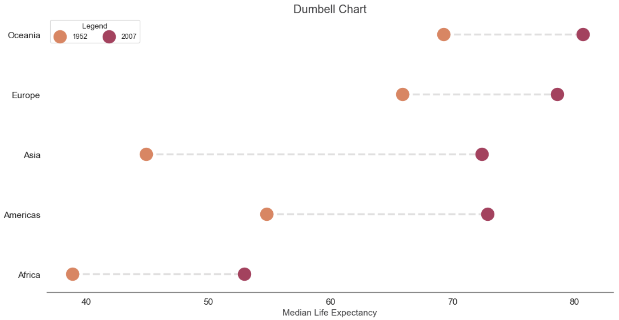
Python code:
import matplotlib.lines as mlines
# Function to draw line segments
def newline(p1, p2):
ax = plt.gca()
l = mlines.Line2D([p1[0],p2[0]], [p1[1],p2[1]], color='#c2c0c0', alpha=0.5, linestyle='--', linewidth=3, zorder=1)
ax.add_line(l)
return l
# Figure and Axes
fig, ax = plt.subplots(1,1,figsize=(16,8), dpi= 80)
# Points
ax.scatter(y=df_2yrs['continent'], x=df_2yrs['1952'], s=400, color='#E5825B', zorder=2)
ax.scatter(y=df_2yrs['continent'], x=df_2yrs['2007'], s=400, color='#B0385E', zorder=3)
ax.legend(['1952','2007'], loc='upper left', ncol=2, title='Legend')
# Line Segments
for i, p1, p2 in zip(df_2yrs['continent'], df_2yrs['1952'], df_2yrs['2007']):
newline([p1, i], [p2, i])
# Aesthetics
plt.title('Dumbell Chart', fontsize=18, color='#3F3F41');
plt.xlabel('Median Life Expectancy', fontsize=14, color='#3F3F41');
plt.ylabel(None);
plt.tick_params(labelsize=14, color='#3F3F41');
sns.despine(left=True);
plt.show()
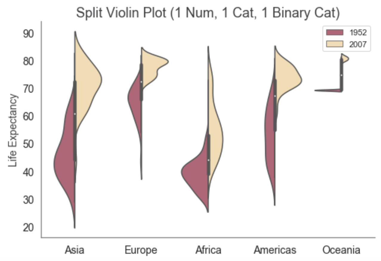
Python code:
sns.violinplot(data=df.loc[ df['year'].isin([1952, 2007]) ],
x='continent',
y='lifeExp',
hue='year',
split=True,
palette=['#C85370', '#FEDFA5']);
plt.legend(title=None);
plt.title('Split Violin Plot (1 Num, 1 Cat, 1 Binary Cat)', fontsize=18, color='#3F3F41');
plt.xlabel(None);
plt.ylabel('Life Expectancy', fontsize=14, color='#3F3F41');
plt.tick_params(labelsize=14, color='#3F3F41');
sns.despine();
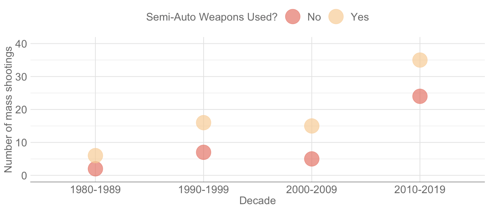
R code:
# Create a new data frame that shows number by decade and whether semi-automatic weapons were used
shootings_per_decade_semi <- aggregate(cleansed_data$for_count, by=list(cleansed_data$decade,
cleansed_data$semi_auto_used),FUN = sum)
# Change the column heading names to Decade, Semi_Auto_Weapons_Used, and Num_Shootings
colnames(shootings_per_decade_semi) <- c("Decade", "Semi_Auto_Weapons_Used", "Num_Shootings")
# Create a bubble chart
bubble_decade_semi <- ggplot(shootings_per_decade_semi, aes(x=Decade, y=Num_Shootings,
color = Semi_Auto_Weapons_Used)) +
geom_point(alpha=0.7, size = 10)+
scale_colour_manual(values = c(colour_palette[70], colour_palette[90]))+
labs(x = "Decade",
y = "Number of mass shootings",
colour = "Semi-Auto Weapons Used?") +
theme(
legend.position = "top",
legend.title = element_text(colour = "#666666", size = 16),
legend.text = element_text(colour = "#666666", size = 16),
legend.key = element_rect(fill = NA, colour = NA),
axis.text.y = element_text(colour = "#666666", size = 16),
axis.text.x = element_text(colour = "#666666", size = 16),
axis.title = element_text(colour = "#666666", size = 16),
axis.ticks = element_blank(),
panel.background = element_blank(),
panel.grid.major = element_line(colour = "#e0e0e0"), # Add the major grid lines back in
panel.grid.minor = element_line(colour = "#e0e0e0"),
axis.line.x = element_line(colour = "#666666"),
plot.margin=unit(c(1,0,1,0),"cm"))+
coord_cartesian(ylim=c(0,40))
# Display the bubble chart
bubble_decade_semi
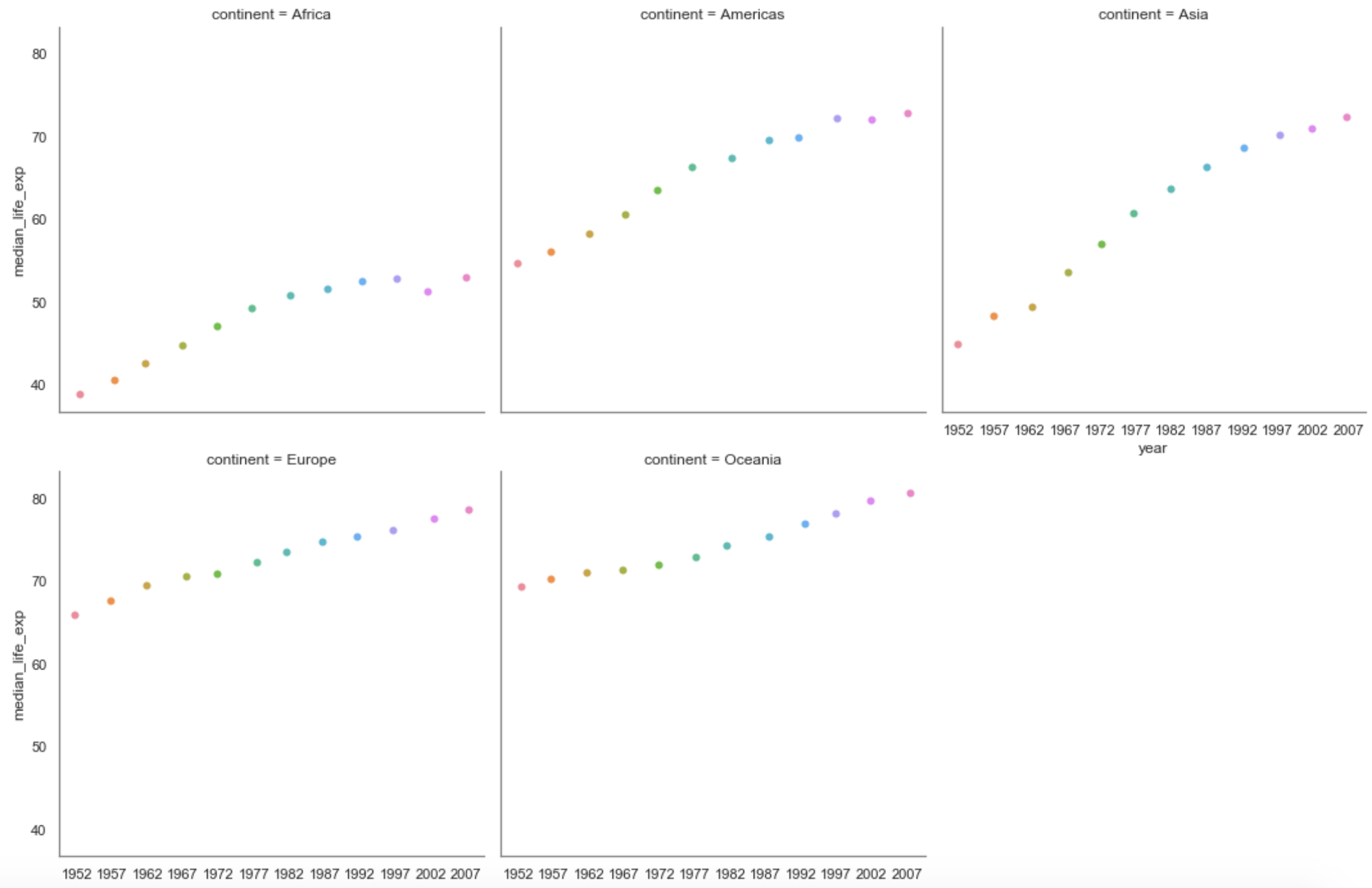
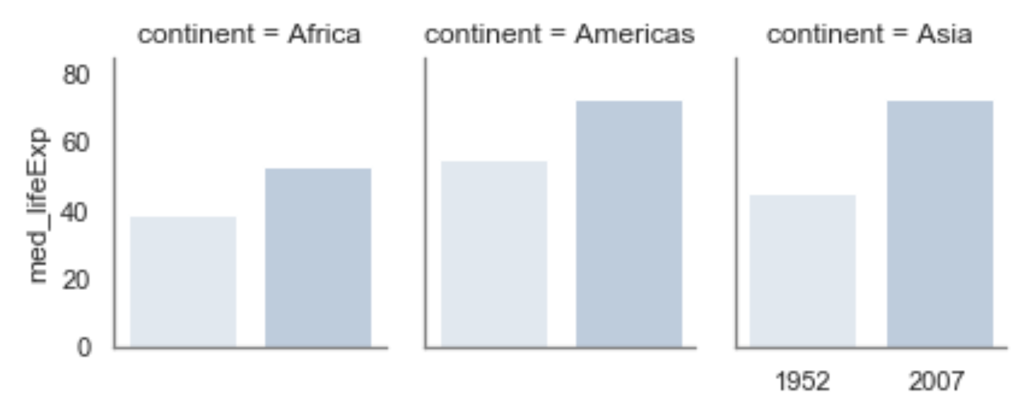
Python code:
sns.catplot(data=two_cats_ft, x='year', y='median_life_exp', col='continent', col_wrap=3, s=6);
Python code:
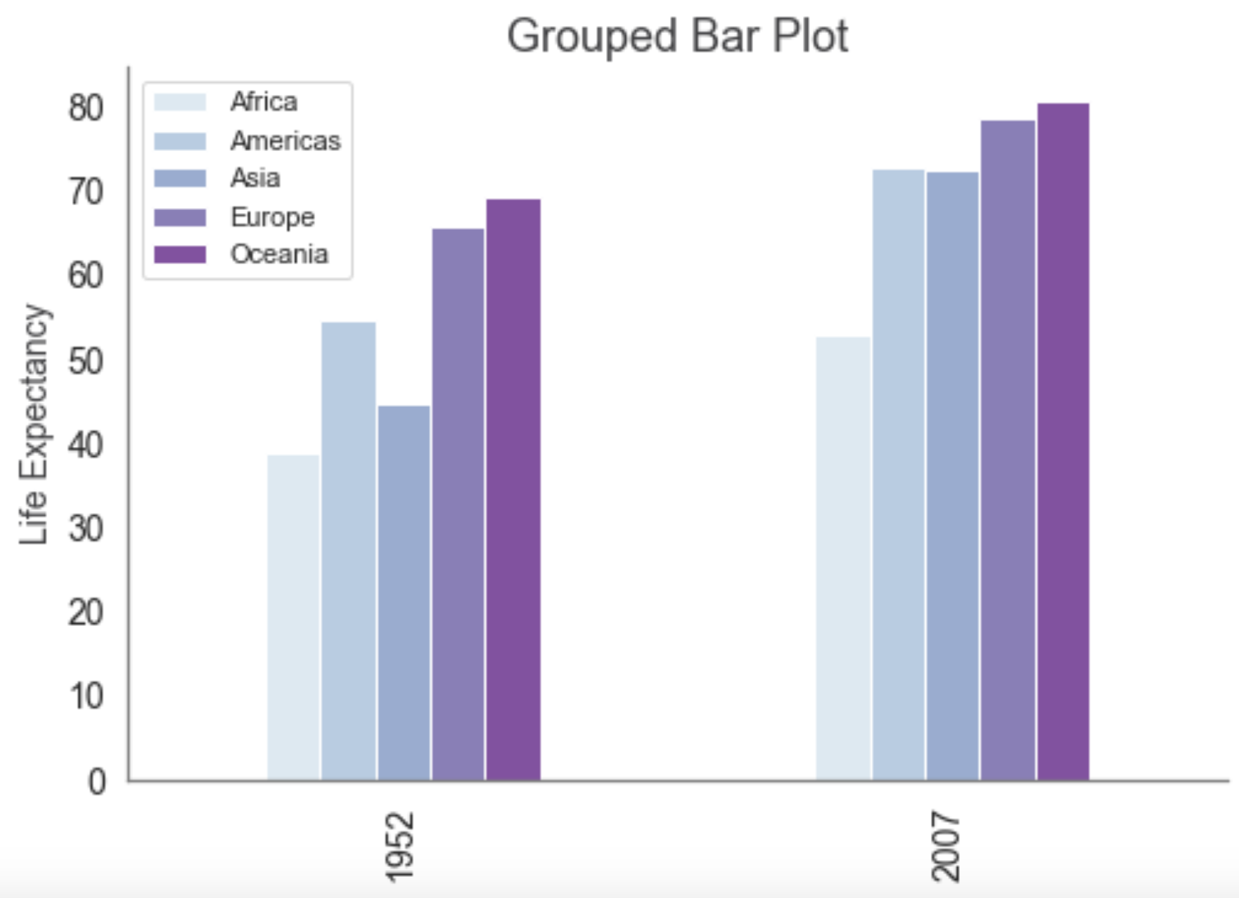
df_2yrs = df.loc[
(df['year']==1952) |
(df['year']==2007)
]
with sns.color_palette("BuPu"):
df_2yrs.groupby(by=['year', 'continent'])['lifeExp'].median().unstack().plot.bar();
plt.legend(title=None);
plt.title('Grouped Bar Plot', fontsize=18, color='#3F3F41');
plt.xlabel(None);
plt.ylabel('Life Expectancy', fontsize=14, color='#3F3F41');
plt.tick_params(labelsize=14, color='#3F3F41');
sns.despine();
Python code:
df_2yrs_2 = df.loc[
(df['year']==1952) |
(df['year']==2007)
]
df_2yrs_2 = pd.DataFrame(df_2yrs_2.groupby(by=['year', 'continent'])['lifeExp'].median())
df_2yrs_2.reset_index(inplace=True)
df_2yrs_2.columns = ['year', 'continent', 'med_lifeExp']
with sns.color_palette("BuPu"):
sns.catplot(x="year", y="med_lifeExp", col="continent", col_wrap=3,
data=df_2yrs_2, kind="bar", height=2.5, aspect=.8);
Two Numbers and One Category
Python code:
df_2007_no_nulls = df.loc[
(df['year']==2007) &
(df['pop'].notnull()) &
(df['gdpPercap'].notnull()) &
(df['lifeExp'].notnull())
]
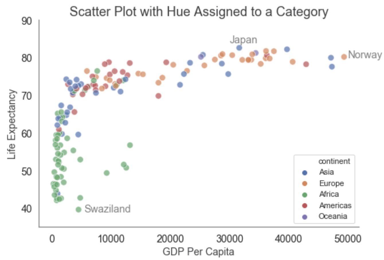
sns.scatterplot(data=df_2007_no_nulls, x='gdpPercap', y='lifeExp', hue='continent', s=75, alpha=0.7);
plt.legend(loc='lower right');
plt.ylim(35, 90);
plt.title('Scatter Plot with Hue Assigned to a Category', fontsize=18, color='#3F3F41');
plt.xlabel('GDP Per Capita', fontsize=14, color='#3F3F41');
plt.ylabel('Life Expectancy', fontsize=14, color='#3F3F41');
plt.tick_params(labelsize=14, color='#3F3F41');
plt.text(5500, 39, "Swaziland", horizontalalignment='left', size='large', color='gray')
plt.text(30000, 84, "Japan", horizontalalignment='left', size='large', color='gray')
plt.text(50000, 80, "Norway", horizontalalignment='left', size='large', color='gray')
sns.despine();
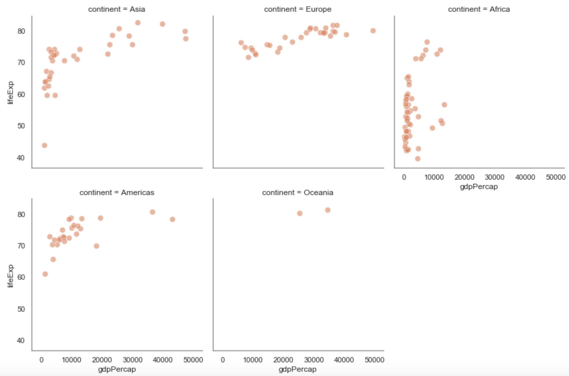
Python code:
sns.relplot(x="gdpPercap", y="lifeExp", col="continent", s=75, color='#E5825B', alpha=0.6,
data=df_2007_no_nulls, height=4, col_wrap=3);
Three Numerical Variables
Python code:
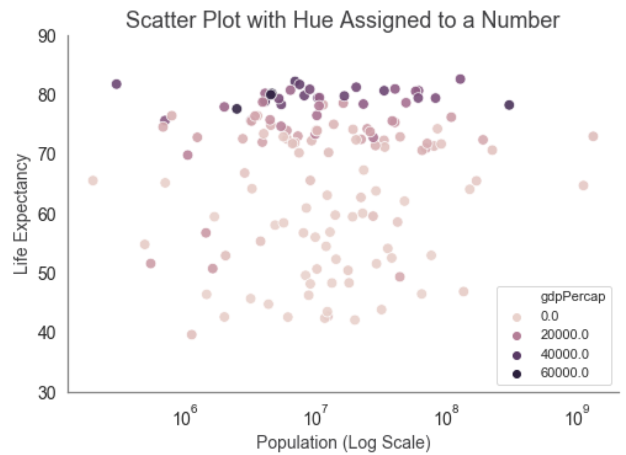
three_num_vars = df_2007_no_nulls.loc[:, ['lifeExp', 'pop', 'gdpPercap']]
sns.scatterplot(data=three_num_vars, x='pop', y='lifeExp', hue='gdpPercap', s=75, alpha=0.9).set(xscale="log");
plt.legend(loc='lower right');
plt.ylim(30, 90);
plt.title('Scatter Plot with Hue Assigned to a Number', fontsize=18, color='#3F3F41');
plt.xlabel('Population (Log Scale)', fontsize=14, color='#3F3F41');
plt.ylabel('Life Expectancy', fontsize=14, color='#3F3F41');
plt.tick_params(labelsize=14, color='#3F3F41');
sns.despine();
Python code:
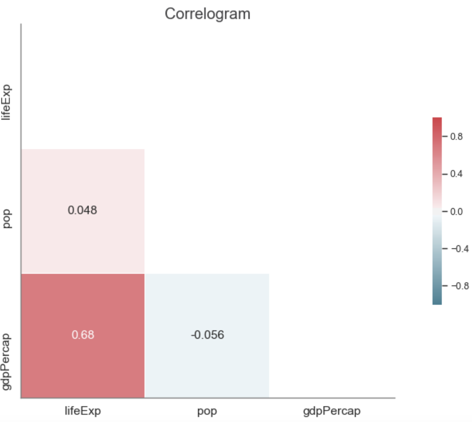
# Generate a mask for the upper triangle
mask = np.zeros_like(three_num_vars.corr(), dtype=np.bool)
mask[np.triu_indices_from(mask)] = True
# Set up the matplotlib figure
f, ax = plt.subplots(figsize=(16,8), dpi= 80)
# Draw the heatmap with the mask and correct aspect ratio
sns.heatmap(three_num_vars.corr(),
mask=mask,
cmap=sns.diverging_palette(220, 10, as_cmap=True),
annot=True,
annot_kws={"fontsize":14},
vmin=-1,
vmax=1,
center=0,
square=True,
linewidths=.5,
cbar_kws={"shrink": .5});
plt.title('Correlogram', fontsize=18, color='#3F3F41');
plt.tick_params(labelsize=14, color='#3F3F41');
sns.despine(left=False);
Python code:
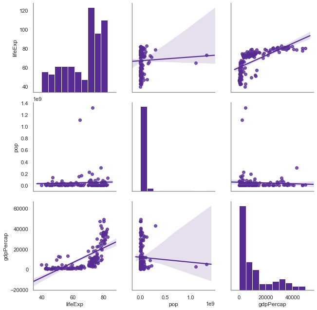
with sns.color_palette("Purples_r"):
sns.pairplot(three_num_vars, height=3, kind="reg");